Tutorial Files
Step 1 – Export Primavera P6 Resource Assignments to Excel
Following the steps from our previous tutorial, you now have all the resources and assignments in an Excel sheet. You can modify the primary sheet for better graphical features.
Step 2 – How to Use the Data
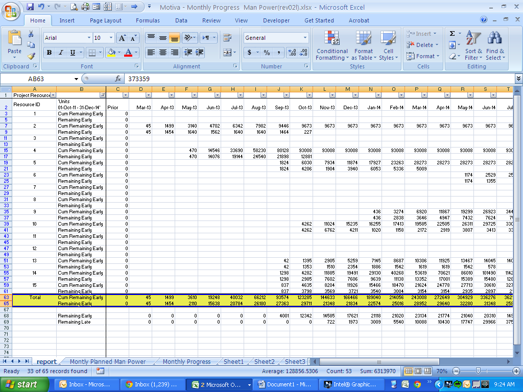
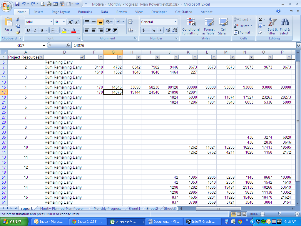
To draw resource curves, what we need is the two highlighted rows which are the cumulative total and the incremental total. They have the information needed for each month. So we just copy and paste these two rows and the date row to another sheet to have more space doing our job.
Step 3 – Copy and paste the needed data in separate sheet
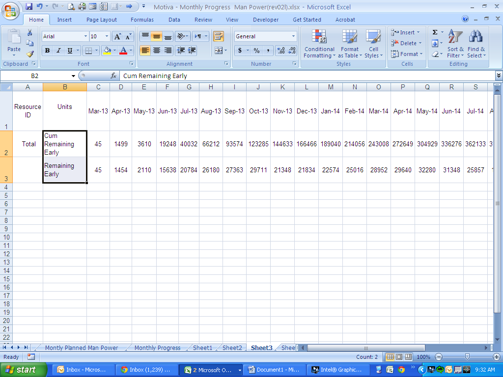
Copy the data to separate worksheet. Now we have all the tools to paint a perfect picture of our project resources. All we need is to use some formula to calculate the percentage progress for each month in our table.
Step 4 – Calculate the Progress Percentage
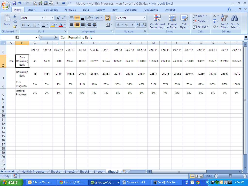
To calculate interval progress and cumulative progress, just divide the value for each month (man hour needed for each month) by the total value (the summation of all man hours). You can see the formula in the Excel file attached to this tutorial.
Step 5 – Graphing the S-Curves
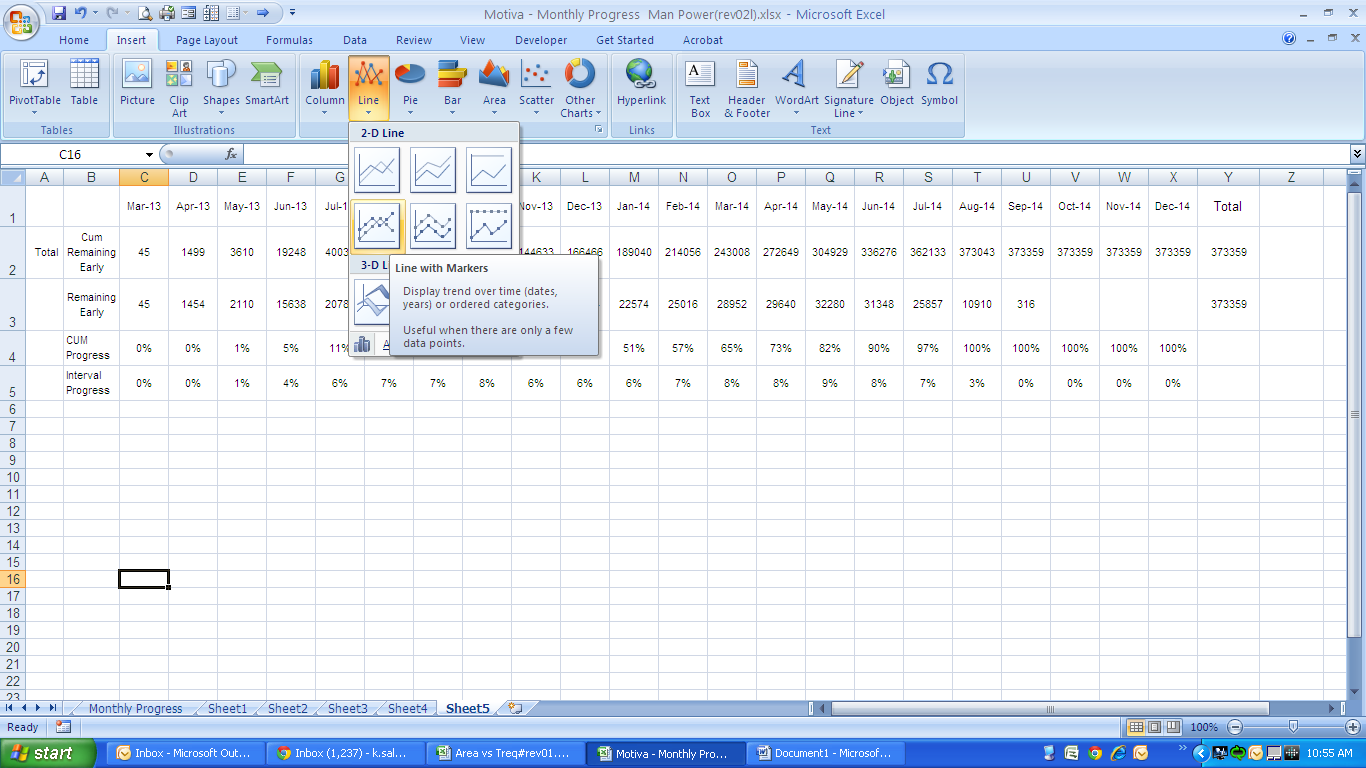
To graph any curve we should go to Insert Section of Excel and then choose a chart type in charts tab. For this tutorial purpose we’ll select the Line chart.
Step 6 – Defining the S-Curve’s Resources
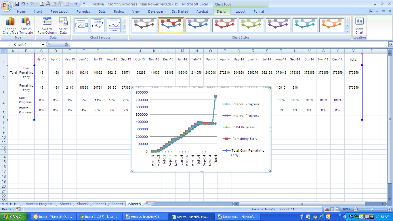
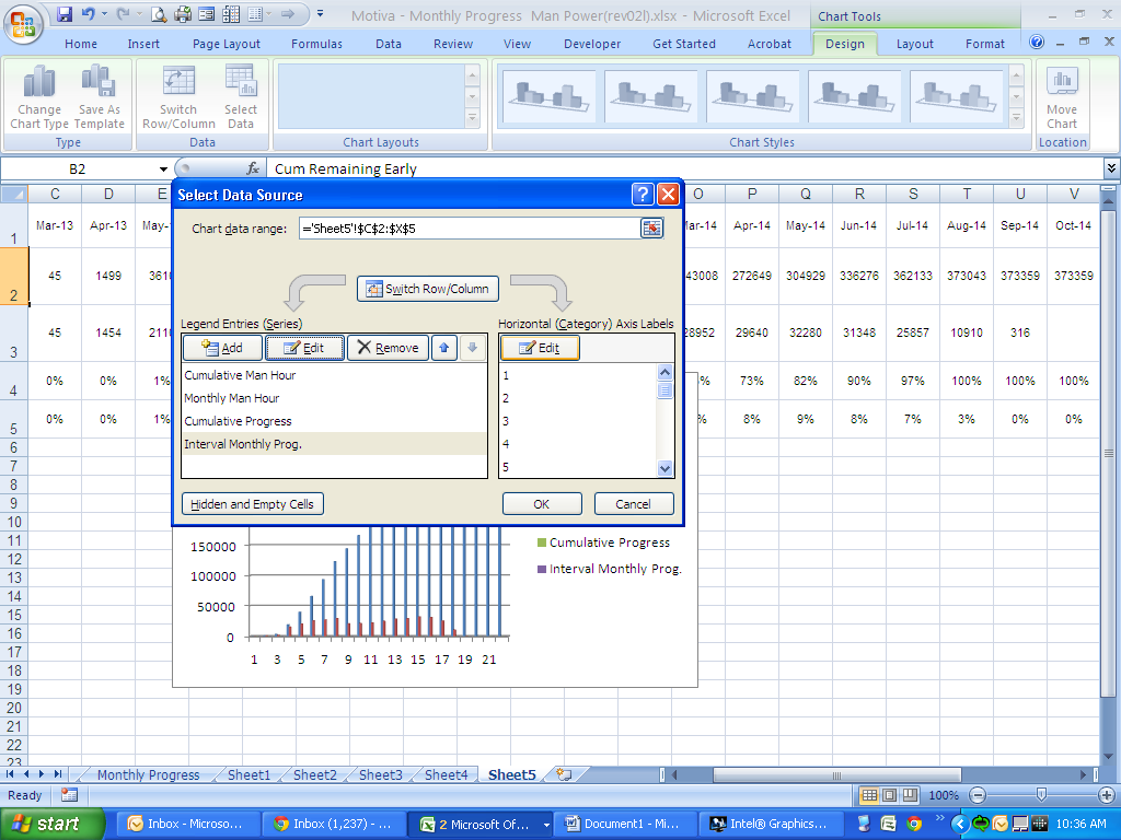
Right-click on the curves that Excel generated by default, which is not the curve that we want, and choose “Select Data”.
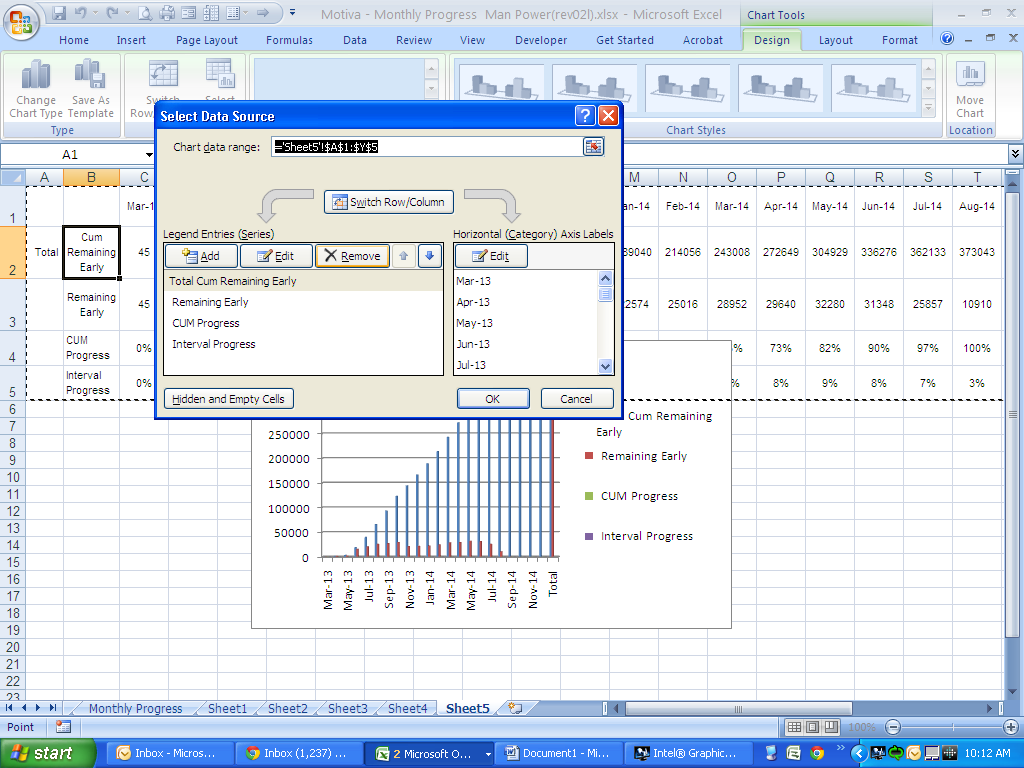
Remove all the predefined sources and then hit the “Add” button.
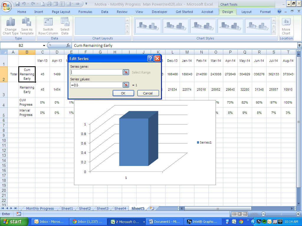
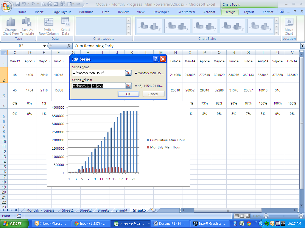
In this box define all the sources one by one. We should do it 3 times to define all the sources for our final S-curve. I define all the series below:
| Series Name | Series Values | Formula |
| Monthly Man Hour | The row that shows interval man hour for each month | =Sheet5!$C$3:$X$3 |
| Cumulative Progress | The row that shows cum. % prog | =Sheet5!$C$4:$X$4 |
The last source definition is for the dates which result in our X axis. To do that on the “select source data” box and under the “Horizontal Axis label”, hit the edit button and you will see a similar dialogue box as the above dialogue boxes:
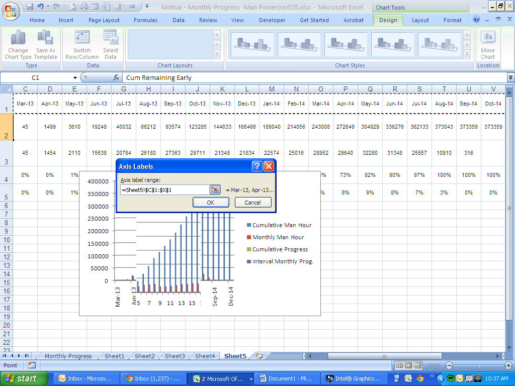
Select all the dates as the label range for the horizontal axis and hit “OK” on dialogue box and then on the “select Data Source” box. Now you have the following chart
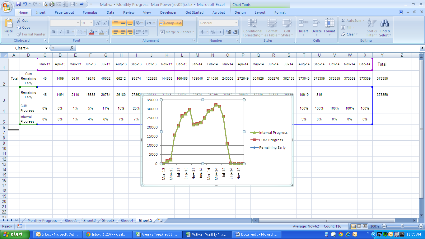
Now we should modify this s-curve, so we go step by step:
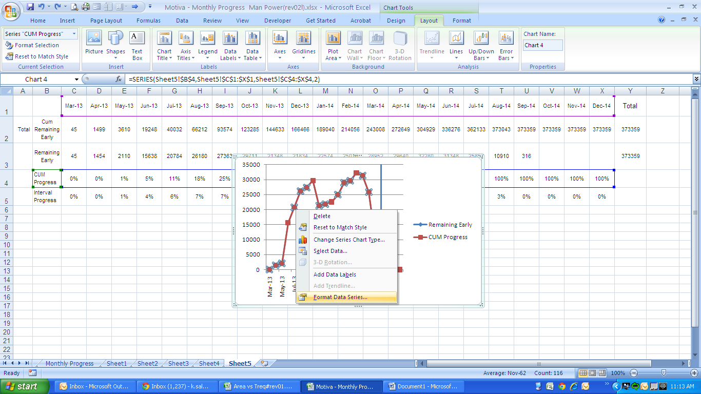
Step 7 – Select a Primary and Secondary S-Curve
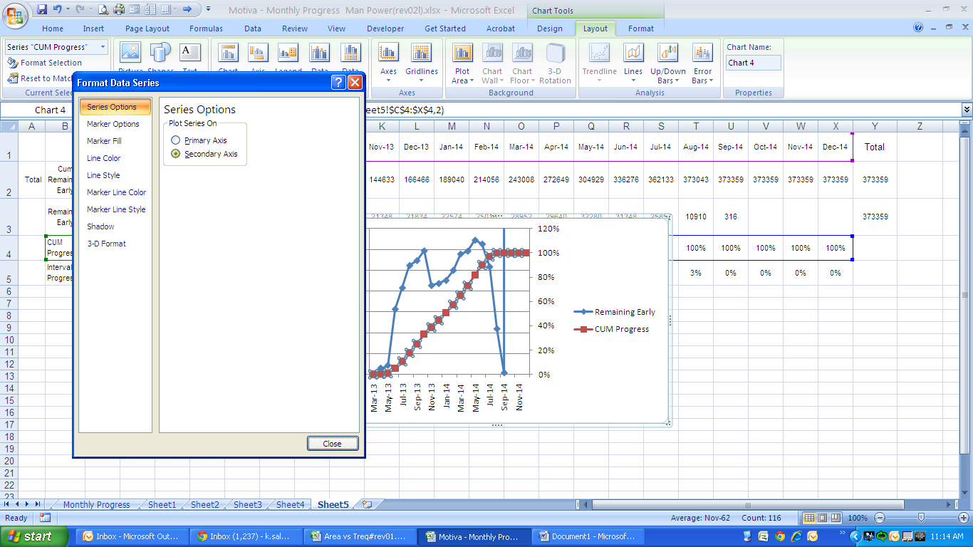
Right-click on the curves and select “Format Data Series”. In the” format Data series” box select the “Cum Progress” as the secondary curve (it means that this s-curve values are shown on the right hand axis)
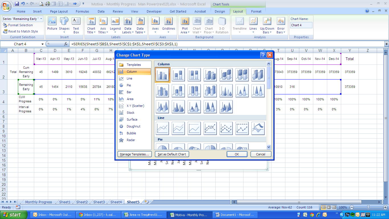
Step 8 – Change the data type to a “2-D Column” chart
Right-click on the monthly interval man hour curve (ie:the blue curve) and then select the “change series chart type”. In the “change series chart type” box, select “2-D Column” chart.
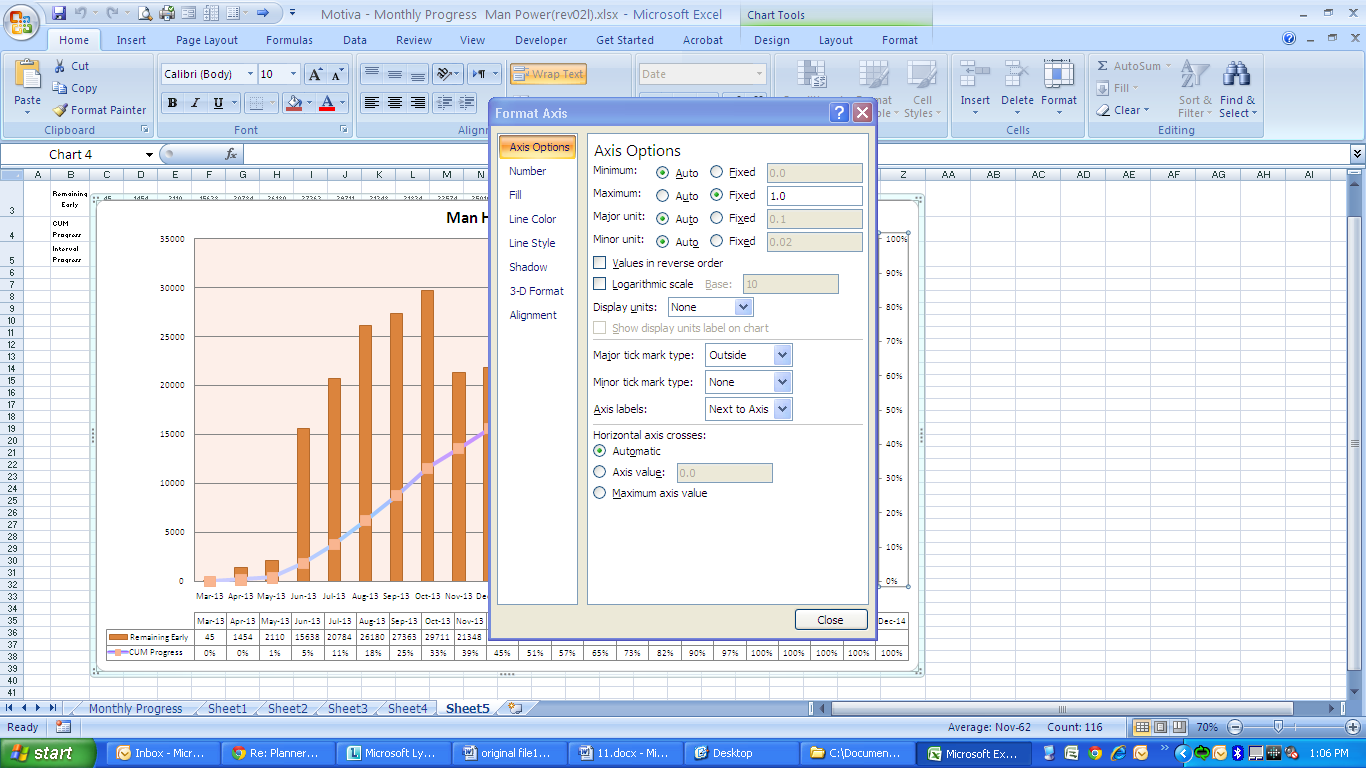
Step 9 – Adjust the Right-hand Vertical Axis
Right-click on the right-hand vertical axis and select “Format Axis” in the dialogue box go to Axis options and change the second value from the top of form to 1.00.
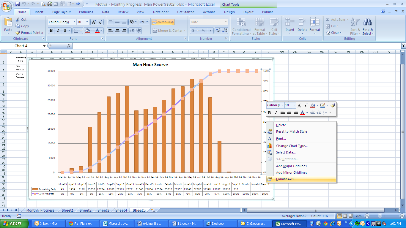
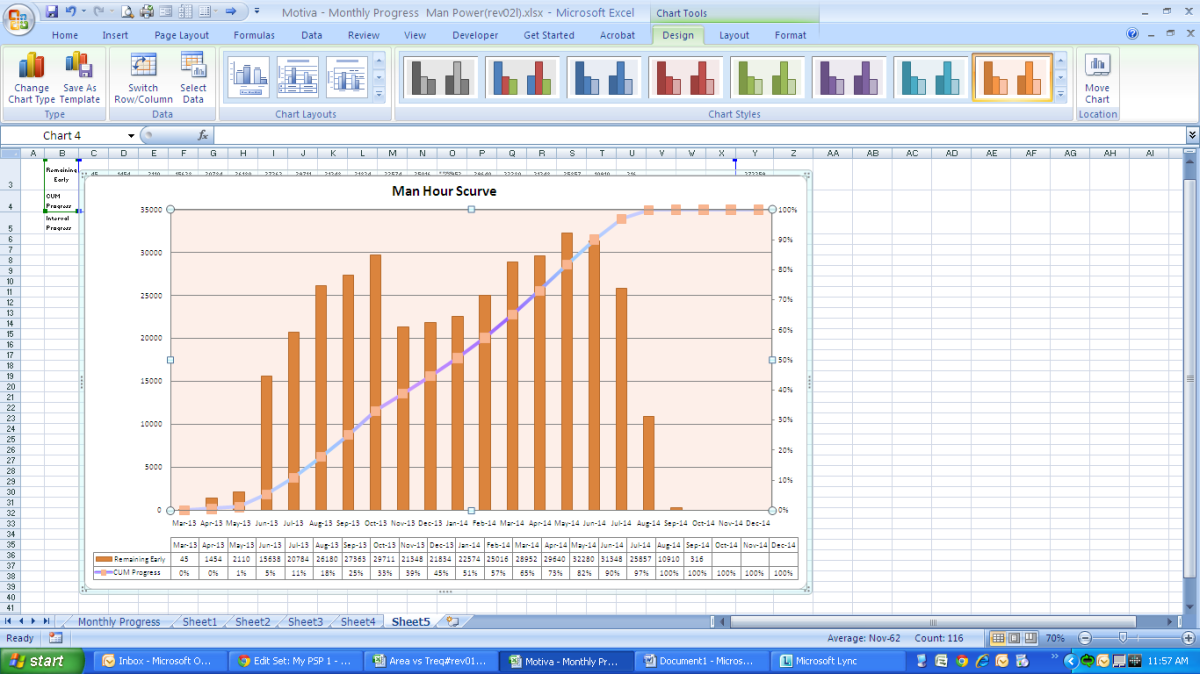
Now you have a resource S-curve which still needs some modification:

Step 10 – The Final Touches
In Excel 2007, when you select a chart, a “chart tool” tab will appear on the top right hand side of toolbar. In that chart you can change the color of curves, add title to curve, add table to curve. The following curve which is the final curve is the result of doing some exercises with those features:

Wrap Up
With this new P6 Resource S-curve, now your project manager can easily tell you there is something wrong with resource assignment and some leveling should be done on resources to achieve a better distributed resource S-curve.
There are different ways of developing S-curves in Excel but this method works well in many project circumstances.
Source : https://www.planacademy.com/p6-resource-s-curve-excel/


